Partners in Paradigm Shift
The new Trimtab logo serves as a visual metaphor for their approach: technically rigorous yet open to disruption, a constant work in progress, and focused on creating leverage points for systemic change. The subtle plus sign in the 't' symbolizes additionality, while the bar it sits within is tilted upward by 3 degrees—a mathematical nod to their three layers of additionality, reinforcing their systems-based approach.
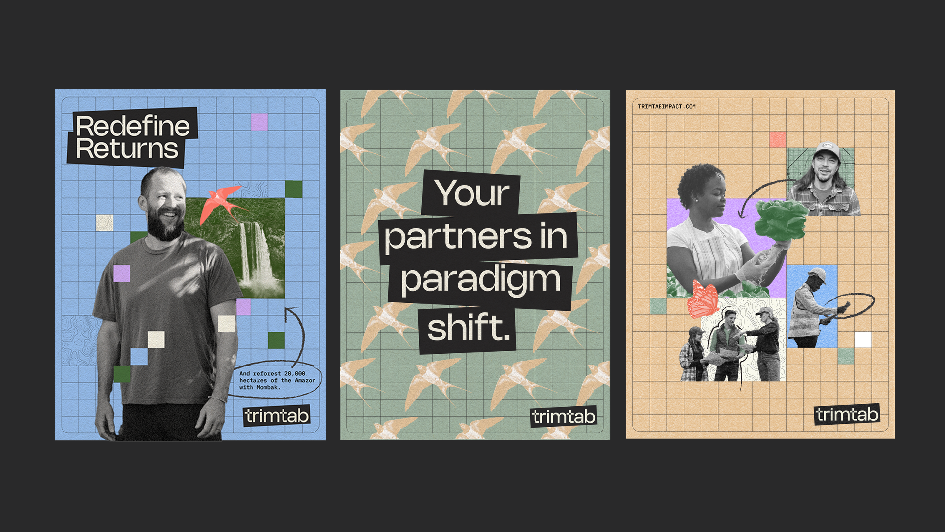
Radically Impact-First
In the fairly polite, serious realm of impact investing, Trimtab wanted a brand expression that would help attract their fellow experimental rebels. With limited photos from diverse partners, we created a style and system taking inspiration from the off-kilter, collaged look of DIY punk flyers, while grounding elements on a grid, signaling technical rigor. The handwritten touches and earth tones are a nod to the people and planet their investors aim to uplift while helping to make the brand joyful and inviting.


To launch the new brand, we completely reimagined their investor deck and created a simple website for them to introduce themselves. The compositions reflect the nature of their work—bringing people and ideas together to build systems change. It’s a call to action to create with us and build the possibility.
Commissioned by and in collaboration with BBMG New York