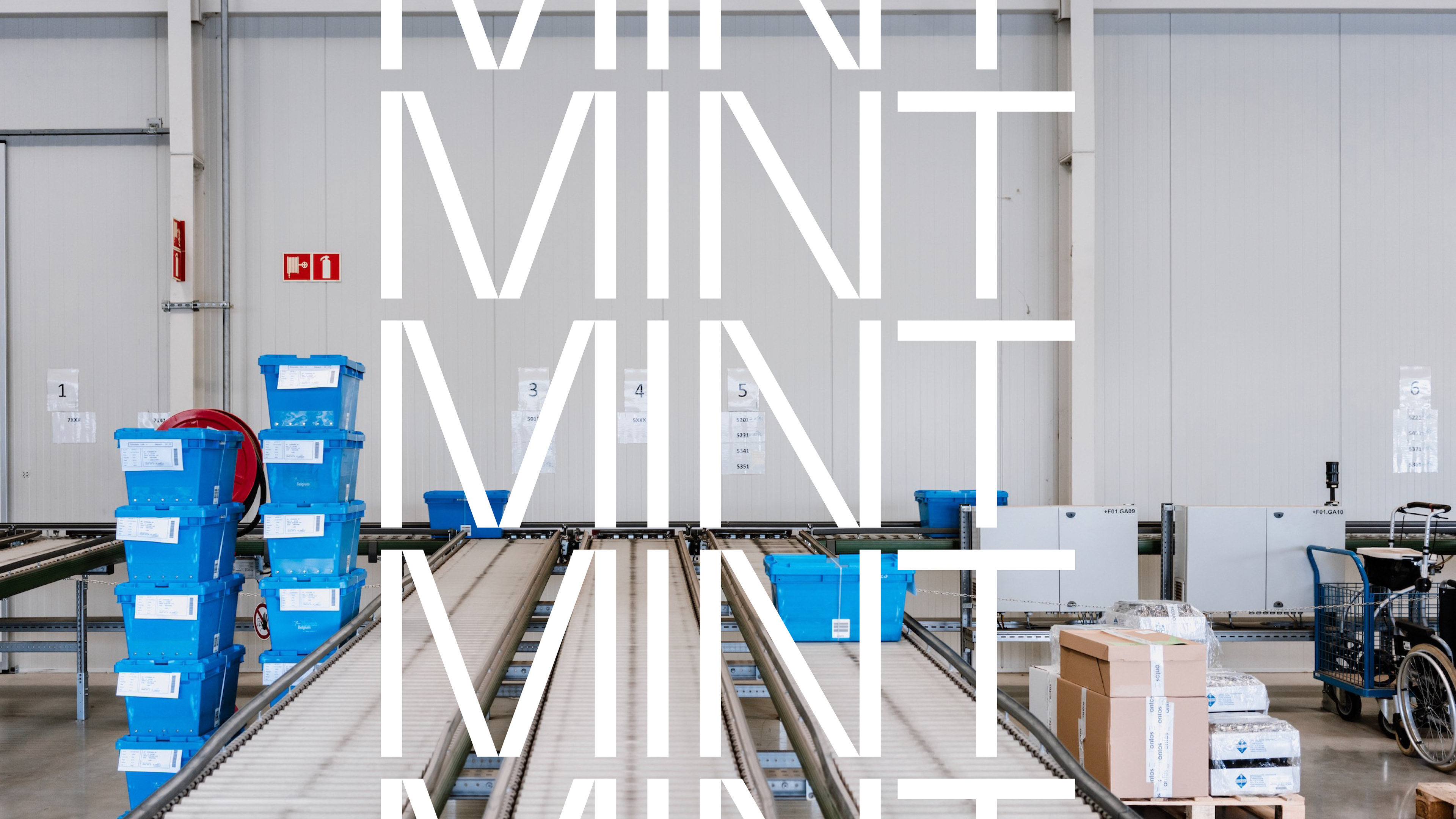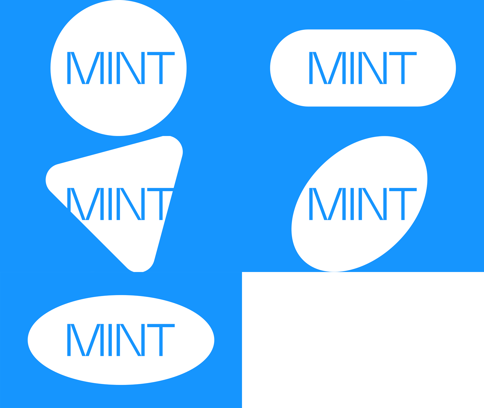


MINT is revolutionizing care support through simplified, modernized, and digitized processes. By tailoring solutions to partners and their patients, MINT offers an extensive care approach that emphasizes personalization. For MINT's visual identity, I designed a logotype that reflects their core business of collecting and distributing pharmaceuticals and health care products. The letters are crafted from a collection of different lines, symbolizing the gathering of diverse products and medications into unique packages. I also made a collection of icons using the same lines and angles from the logo to maintain a cohesive design language. Pill shapes were incorporated as graphic elements to reinforce the connection to the healthcare industry. The azure blue used in the design matches the color of the industrial crates, which play a crucial role in the distribution process and are a familiar sight at every stage.


