
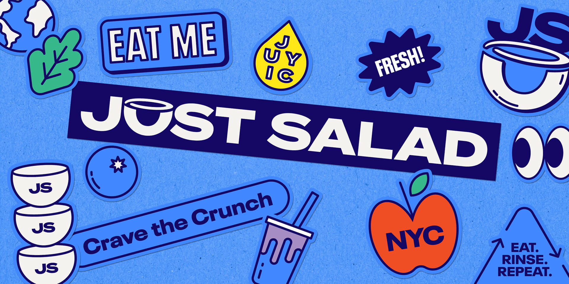
Crave the Crunch
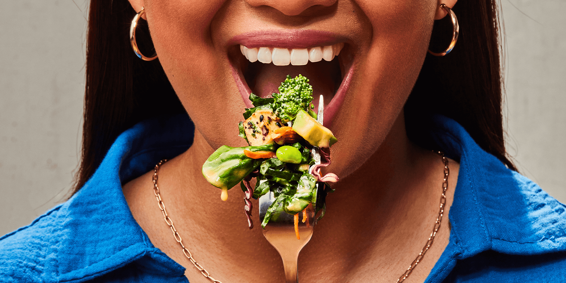
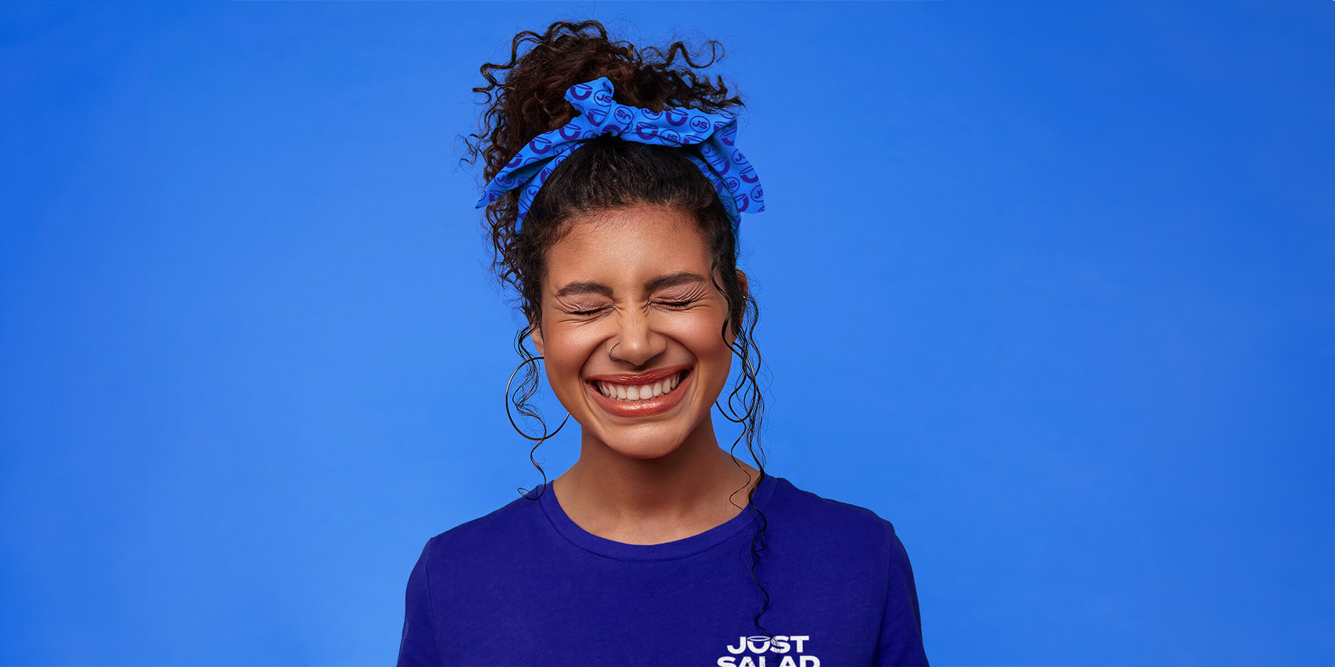
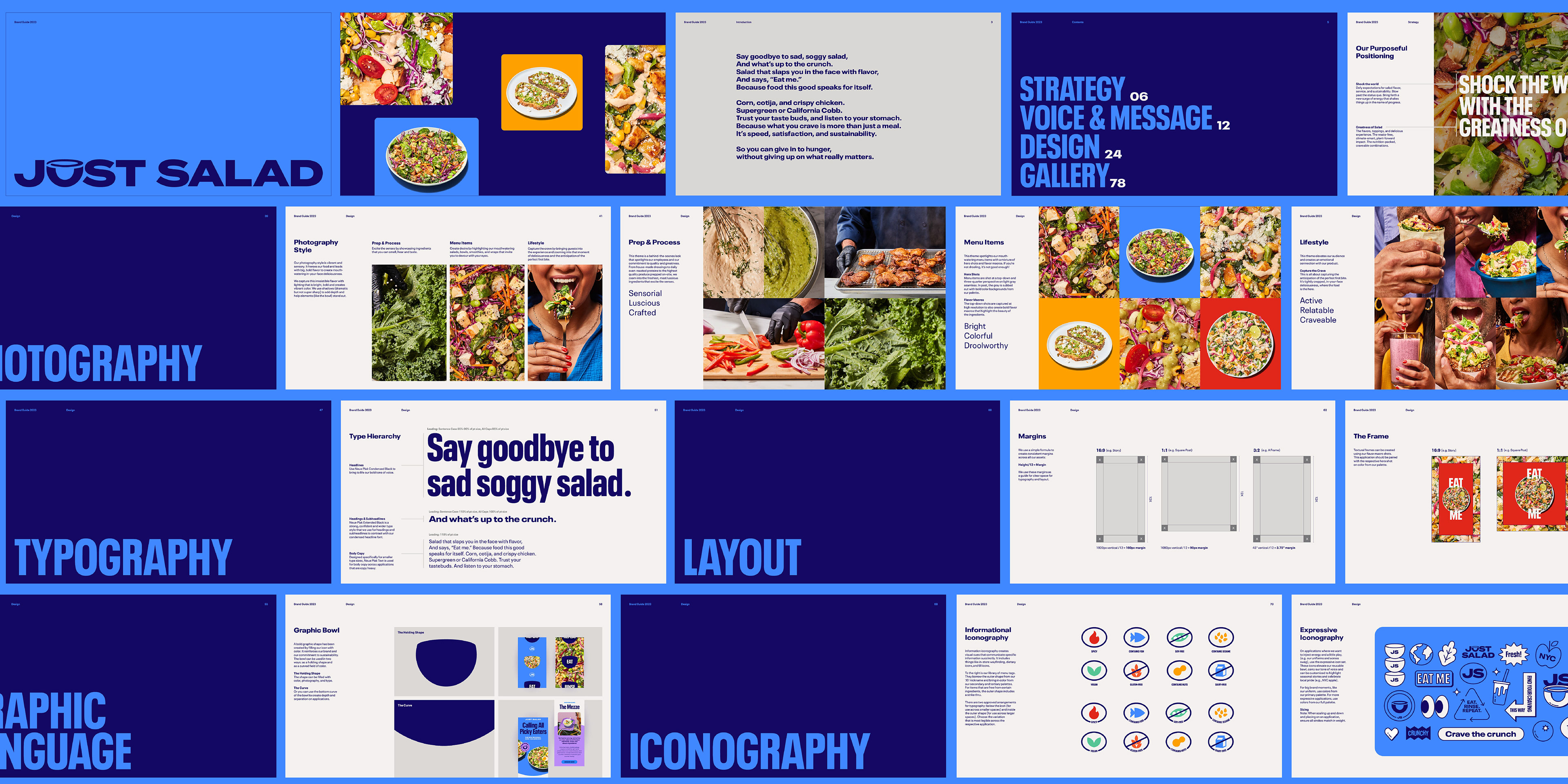
Our research found Just Salad fans to be goal-oriented and practical in their approach to life. They want speed, satisfaction, and sustainability – no compromises. To grow this audience, we positioned Just Salad as making better choices easier, so you can give in to hunger without giving up on what really matters. The new branding is as bold and craveable as their flavors, with an irreverent tone right at home with their NYC roots. Salad that slaps you in the face with flavor and says, “Eat me.”

Can’t. Not. Eat. It. All.
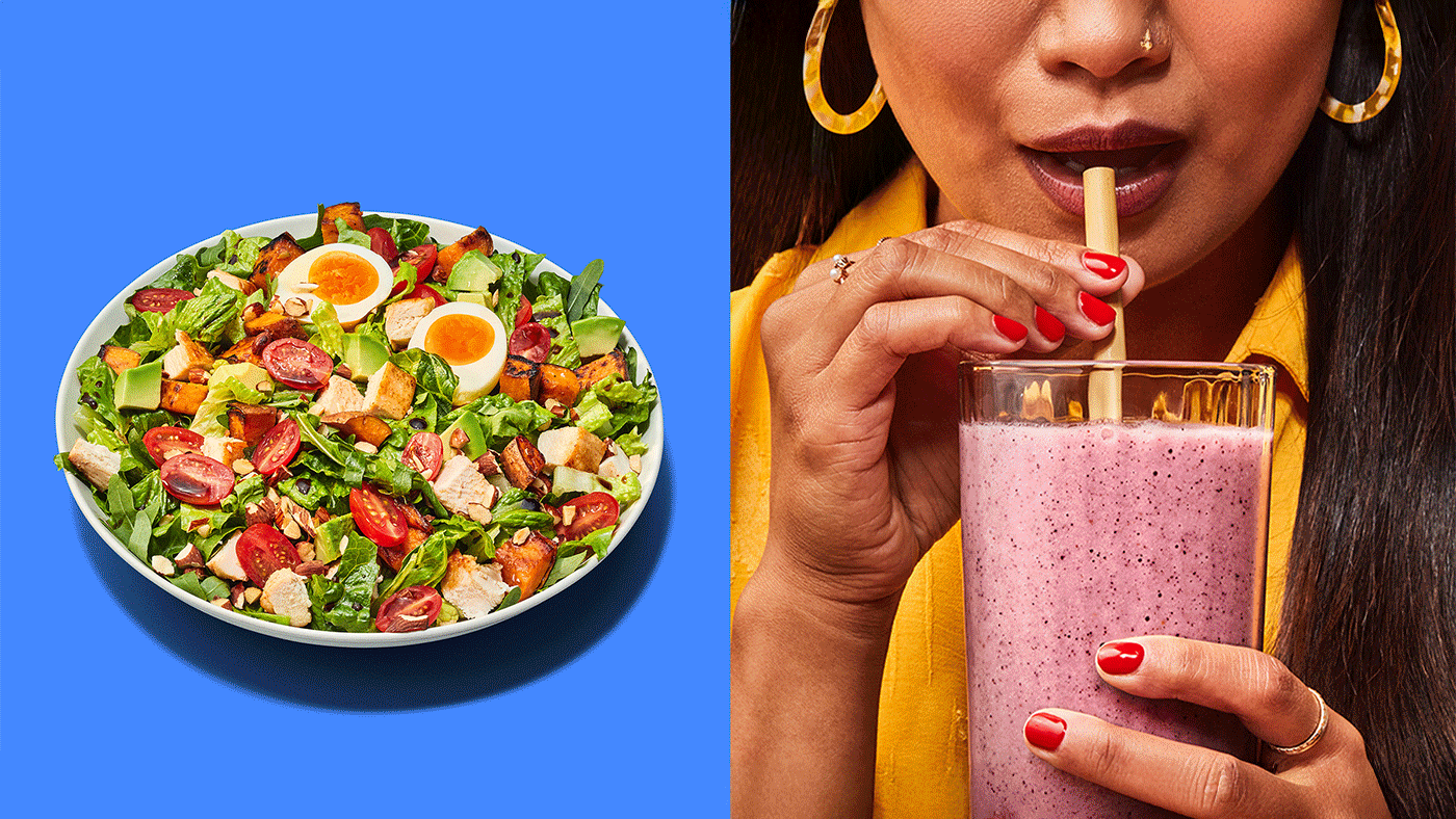
From the color palette to photography to iconography, every element of the design system was intentionally created to lead with flavor. Building on brand equity, we amped up the boldness in the logo and added more dynamic, vibrant, and differentiating colors to the palette. And we directed a product photoshoot to capture a library of mouth-watering photography featuring the full menu and lifestyle imagery to create desire, excite the senses and capture the crave.
Bowl Licking Encouraged
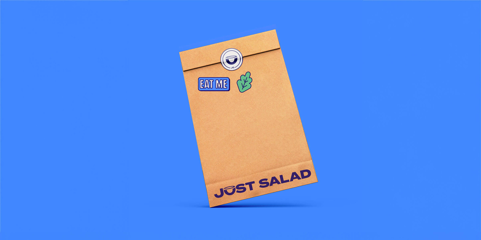
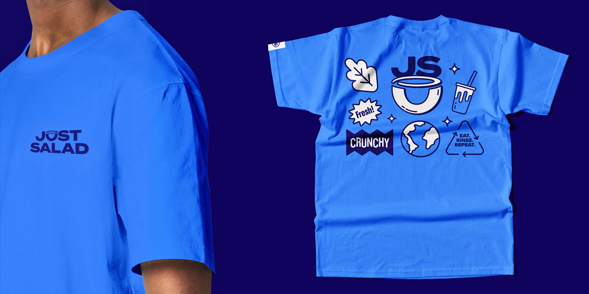
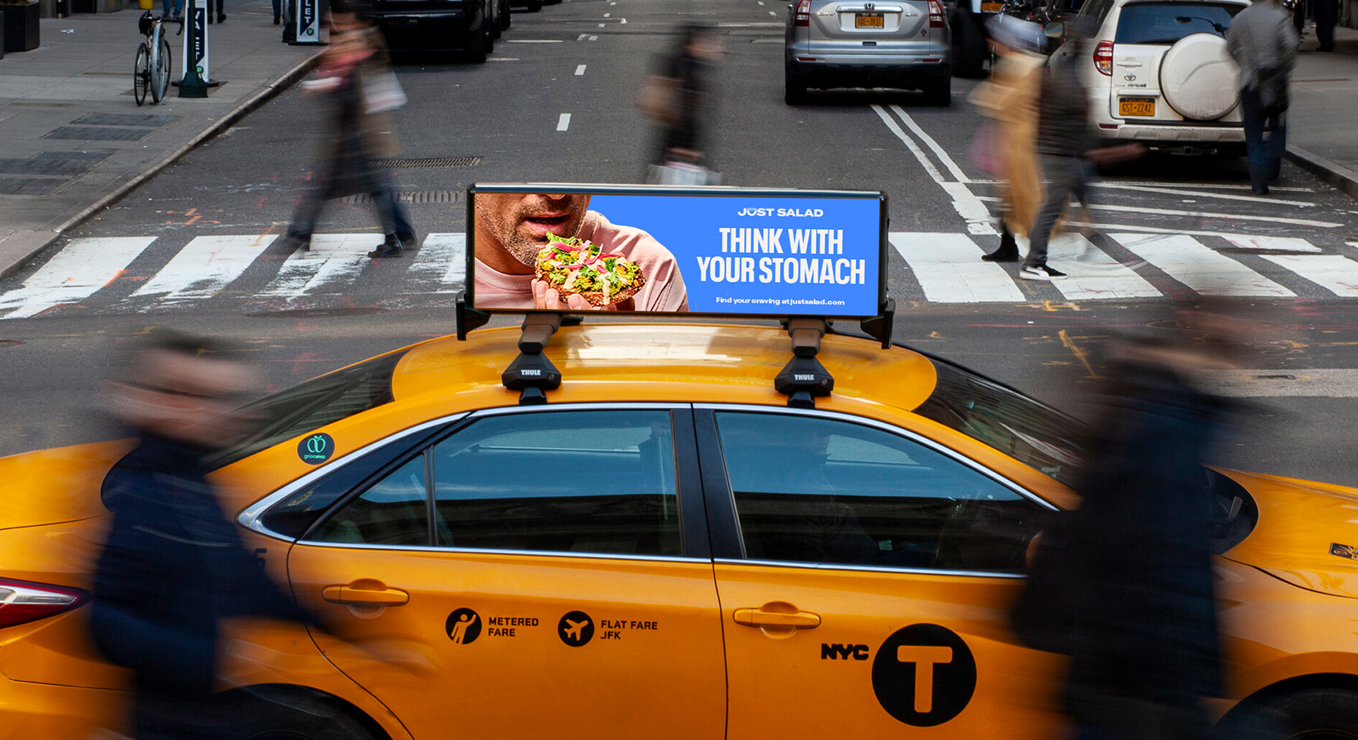
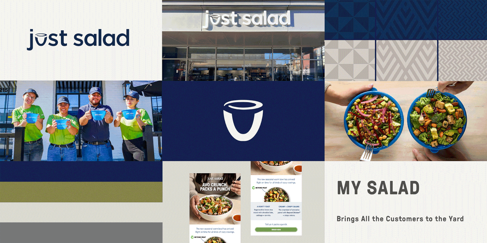
The new graphic language uses their iconic reusable bowl as a holding shape for a variety of applications so that their sustainability leadership is never far from mind. And we also created a library of expressive icons and stickers to inject energy and a little play. A comprehensive brand guide and assets were created to address a number of touchpoints — online, in-store, delivery, OOH, menus, uniforms— as well as a menu that really is much more than just salad.

Before & After
Commissioned by and in collaboration with BBMG New York