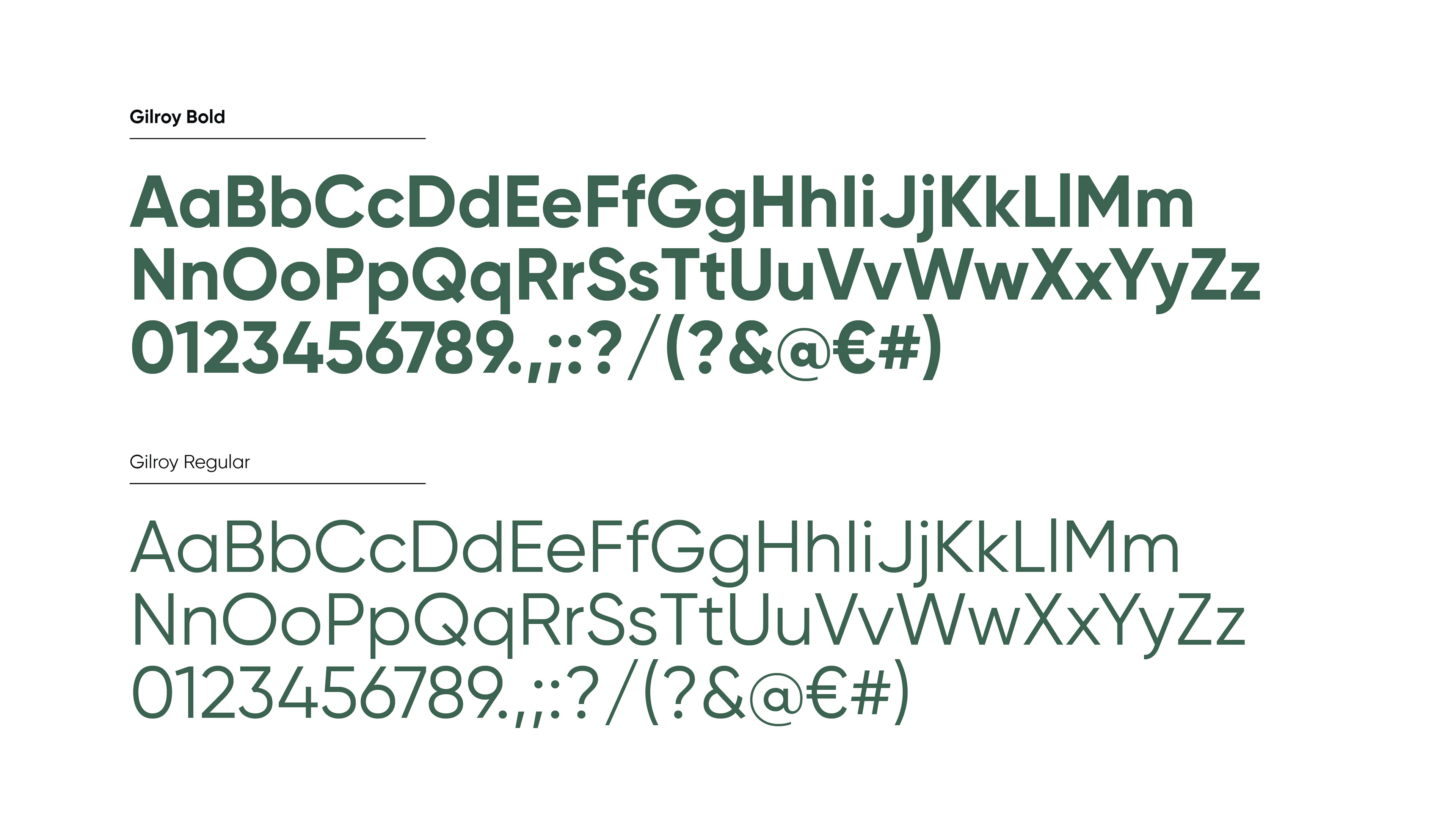


In 2020, I had the privilege of working with Exaequo, a Belgian non-profit dedicated to promoting health and safe sex among men who have sex with men. I was tasked with refreshing their brand, creating a new logo and visual identity that truly captured their mission and values. The logo features the æ-ligature, merging two identical shapes to symbolize unity, with a heart encircling the letters to represent protection and a safe space for discussions. To further emphasize Exaequo's message, I incorporated a pattern of clear line icons representing key aspects such as safe sex practices, open conversations, and regular testing. The color palette combines a strong dark green with a vibrant lavender pink, balancing maturity and freshness. The dark green conveys stability and trust, while the lavender pink adds vibrancy and approachability, creating an overall aesthetic that is both contemporary and engaging.


